

Bringing vision to life with a brand rooted in community, energy, and showing up.
Services
Brand Identity
Merchandise Design
Website Design
Physical Space Consultation
Jackie and Anthony have been pillars of the Charleston fitness scene for years—competing in CrossFit, coaching others, and building lasting relationships within the community. Opening a gym of their own had always been the dream. But the timing was never right—until it was.


When it came time to brand RFC, they knew they didn’t want to open another CrossFit gym. They wanted something broader, more inclusive. Their focus: strength, endurance, and long-term health. Less intimidation, more momentum. Less performance, more purpose.


We built the brand to reflect that energy. We used typography with a subtle, nostalgic edge—designed to resonate with 30-somethings who wanted to feel strong, capable, and connected again. While early conversations leaned toward a butterfly as a symbol of transformation, what kept coming through was ignition—the idea of sparking something inside. That’s where the spark icon came in, and the tagline that followed: “Better in here, better out there.” This brand is more than a logo—it’s a rallying point for a community.
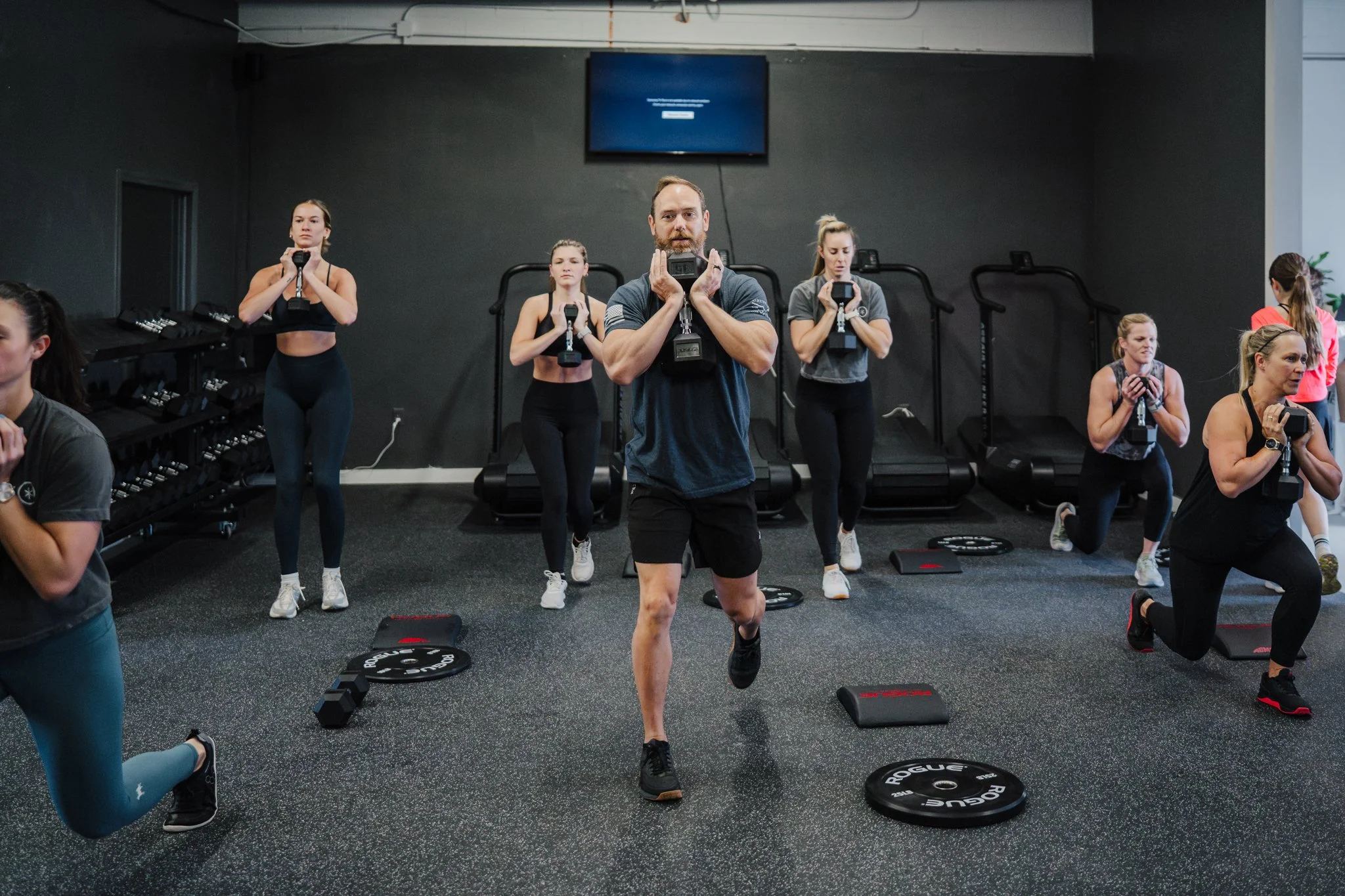
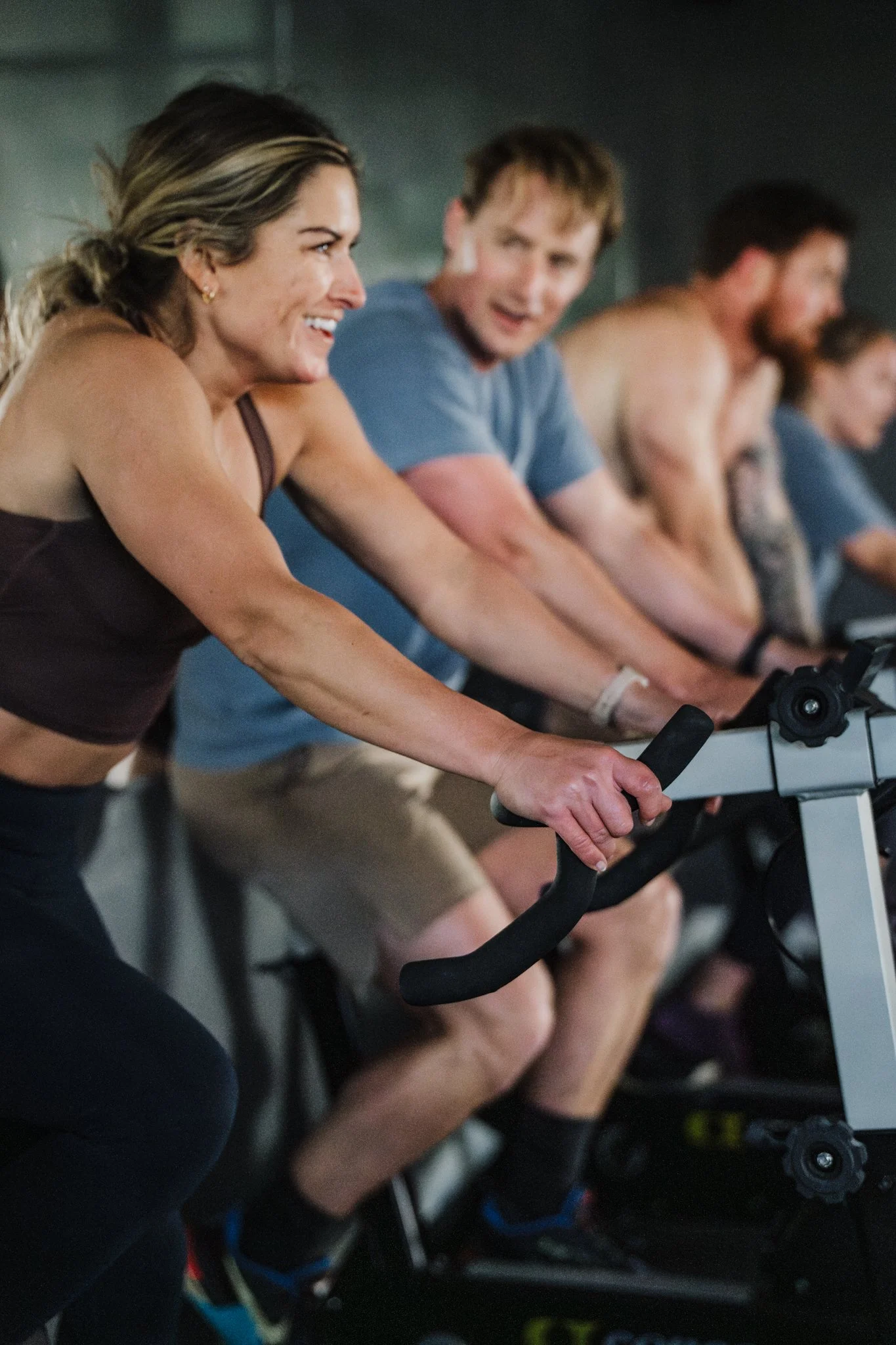

From the very first conversation, it was clear this wasn’t just a gym—it was something personal. Jackie’s vision was bold, intentional, and completely rooted in people. This space would be a third place: for parents squeezing in workouts between school runs, for former athletes reigniting their drive, for anyone ready to show up for themselves in the gym so they could show up beyond it.
