Bringing grit and refinement together with a brand that makes room for both.
SERVICES
BRAND NAMING
IDENTITY DESIGN
WEBSITE DEVELOPMENT
CREATIVE DIRECTION
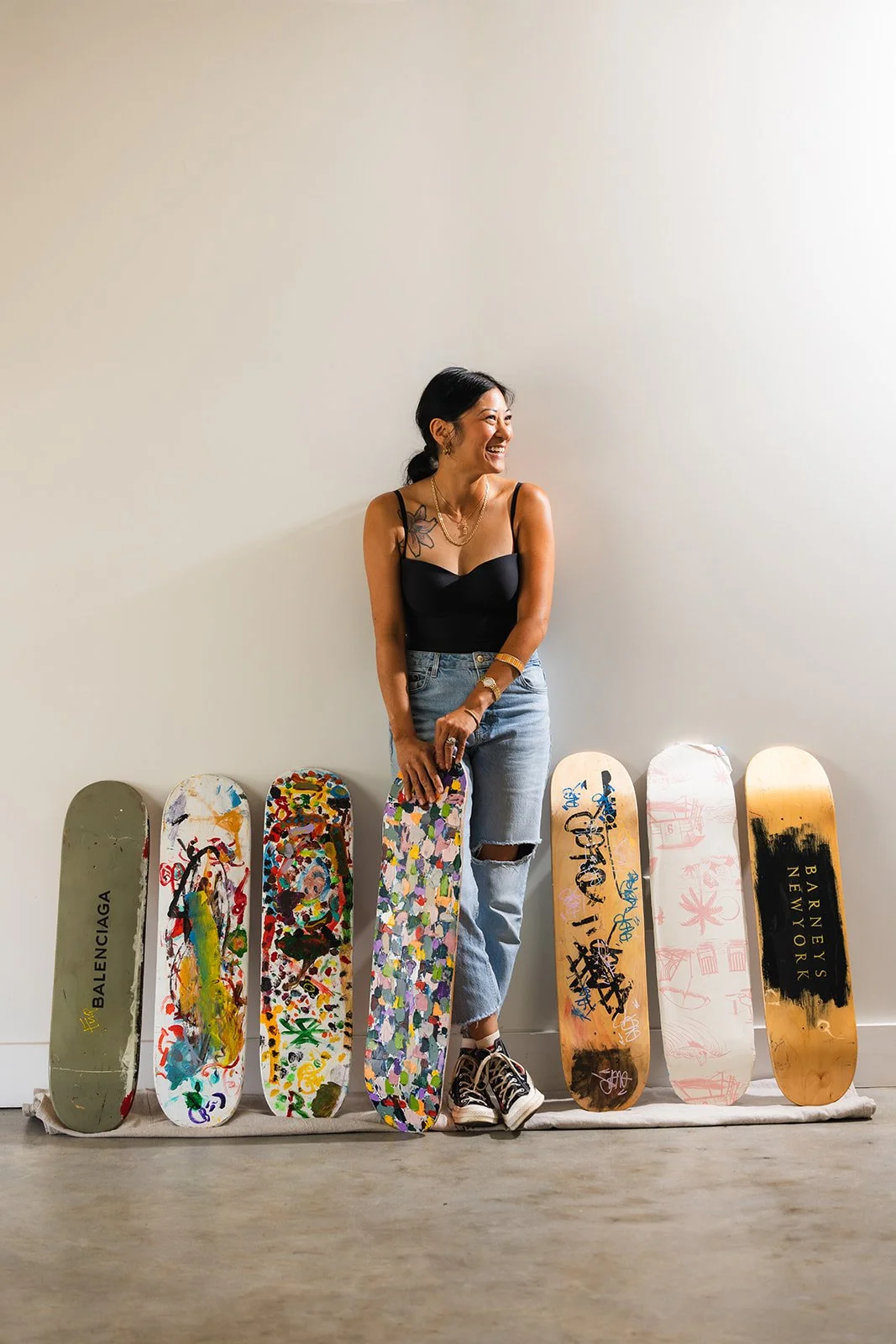
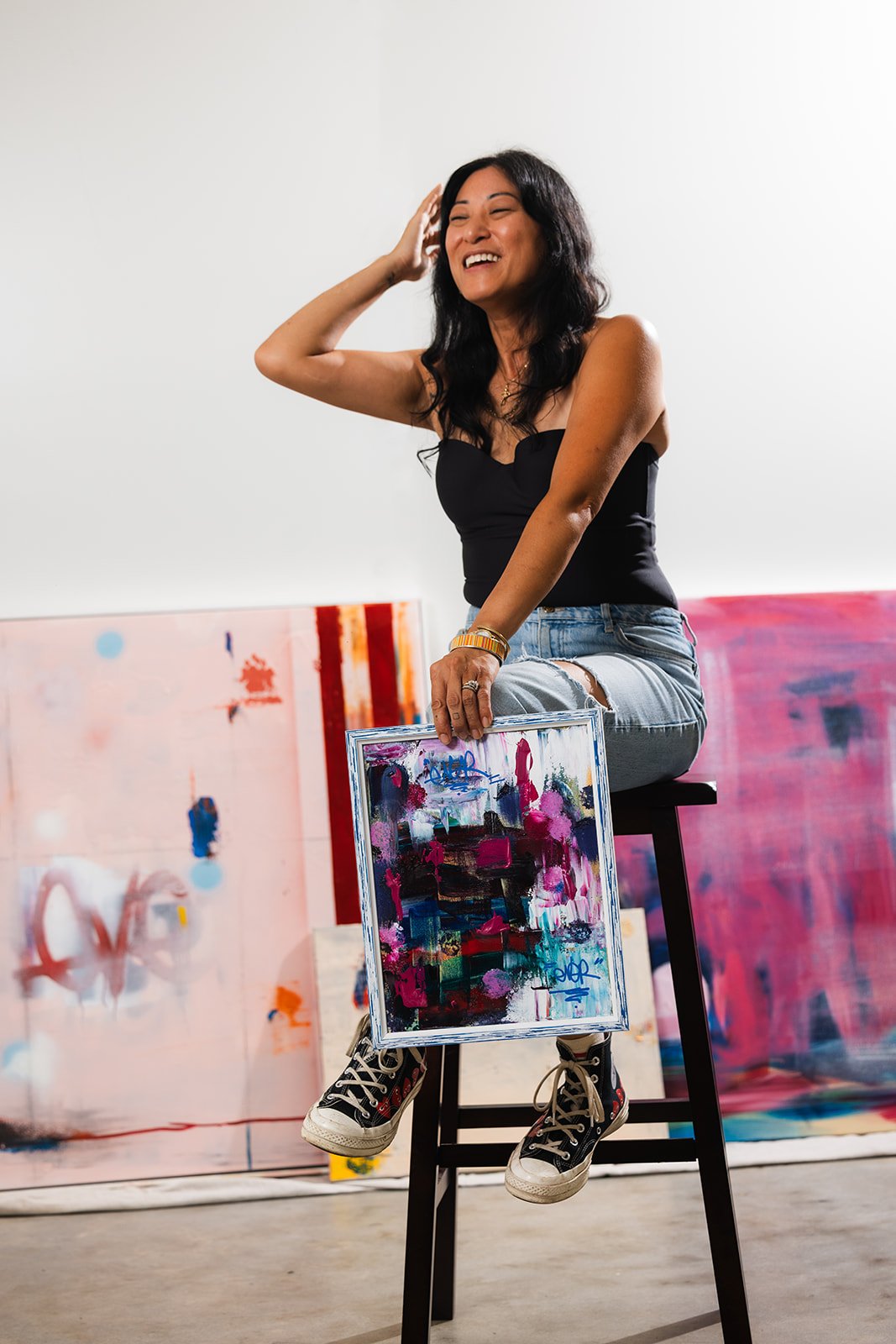
Nina had been making art for years, but turning it into a business meant figuring out how to put a brand around something that was deeply personal. She makes original artwork, prints, and one-of-a-kind skateboard decks, and no two pieces are quite the same. The problem wasn’t figuring out how to make Nina look like a professional artist. It was making sure that in the process, we didn’t turn her into some polished, gallery-approved version of one.
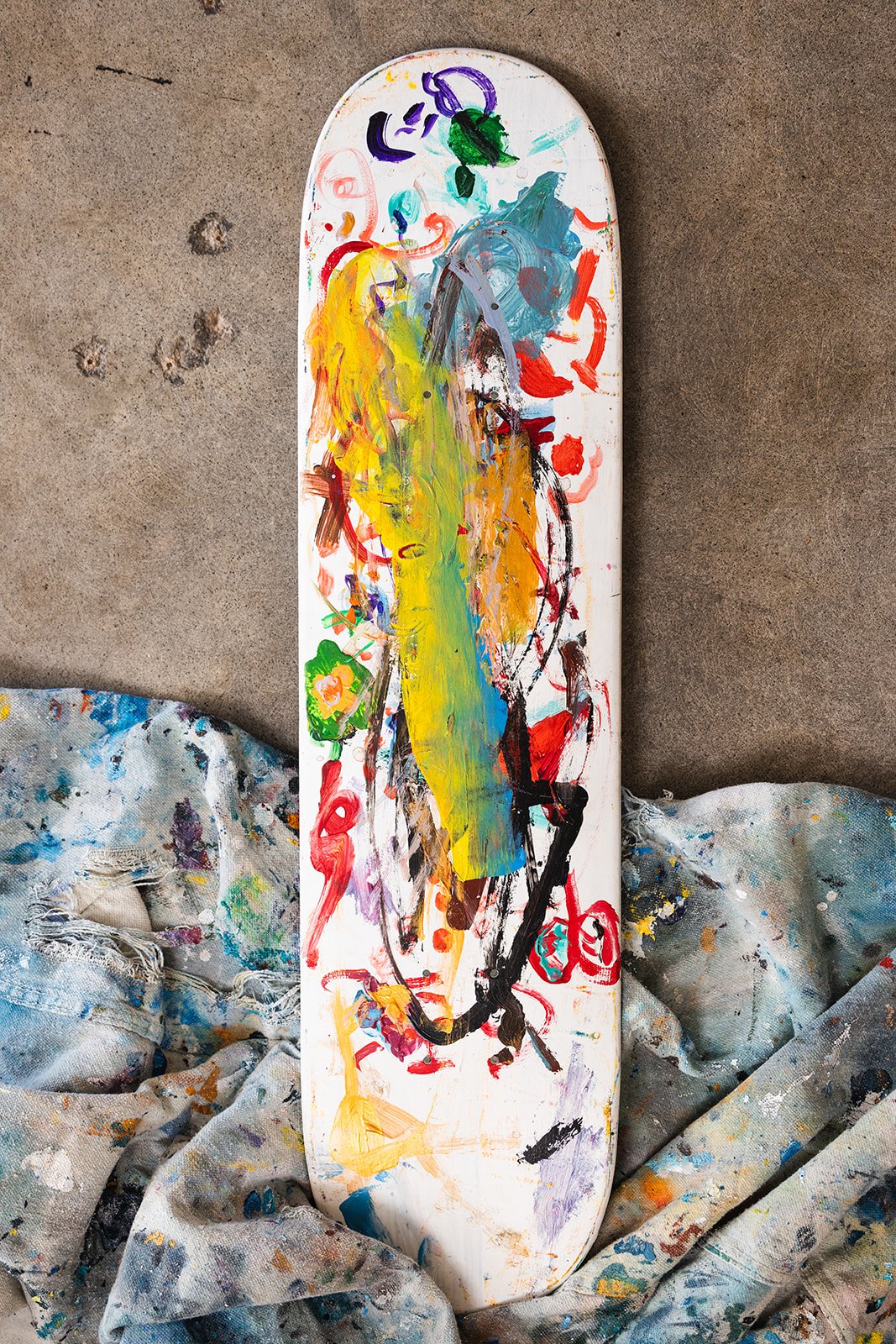
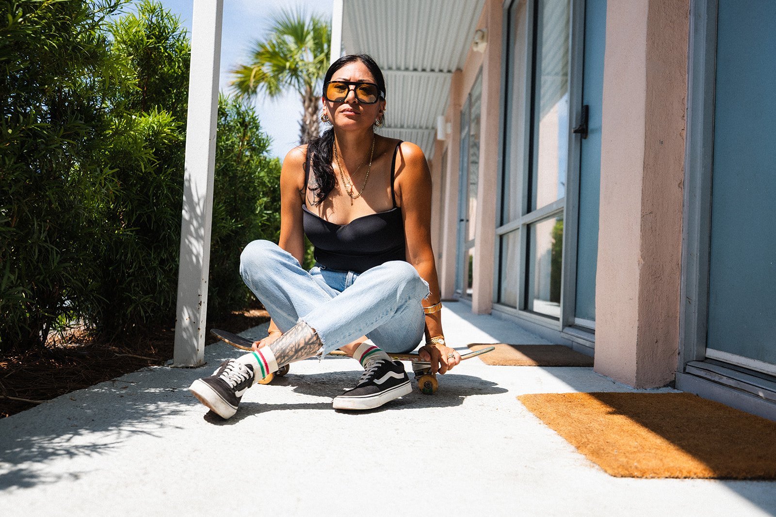
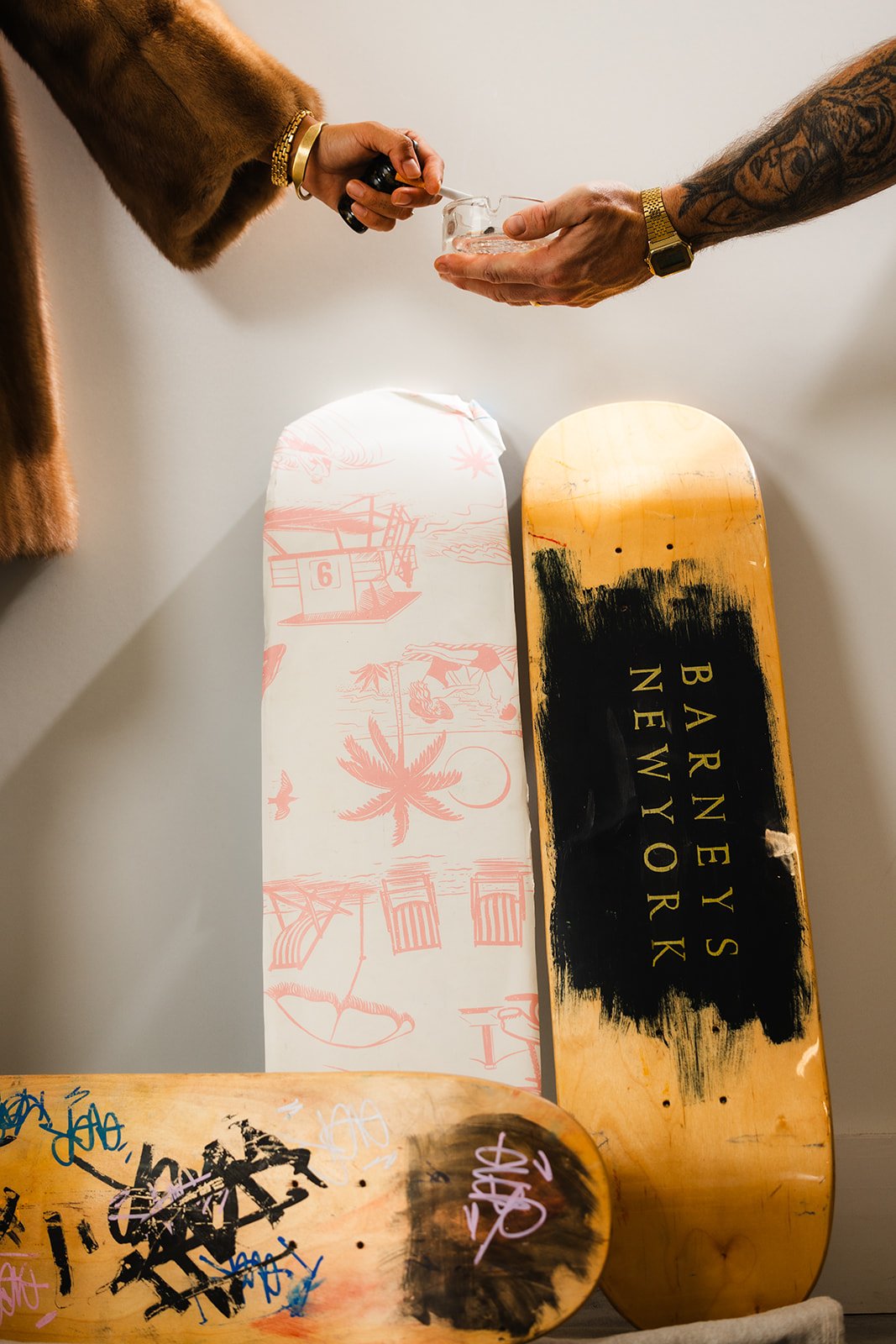
Nina described herself as a walking contradiction: graffiti and gold chains, but also polished silver and fine china. Skateboards and spray paint alongside caviar, pearls, vintage cars, and a really good dinner party. Instead of trying to clean up those contradictions, we realized they were the whole point. Her ideal customer lives somewhere in that overlap too. They care about quality and have the money to invest in original art, but they’re more likely to splurge on a classic car or something made by an independent artist than whatever luxury brand everyone else is buying. The brand needed to give Nina’s work the confidence and value of an established artist without losing the grit, humor, and personality that made it hers in the first place.

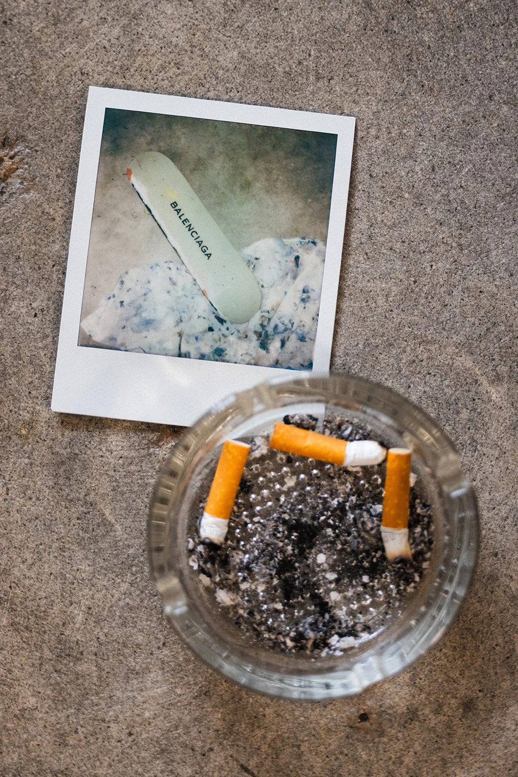
While working on the wordmark, I noticed a small “III” hiding in the letterforms. The negative space immediately reminded me of a photo Nina had taken of two of her painted skate decks standing side by side, so we pulled it out as a secondary mark. It also had this slightly gothic, tattoo-like quality to it—like something Nina could have across her fingers—which made it feel even more at home in her world. Alongside that more polished mark is EVER, a loose, graffiti-style signature pulled from a song lyric that Nina had already made part of her identity online. The result is a brand that feels just like Nina: a little polished, a little gritty, and not particularly interested in choosing between the two.
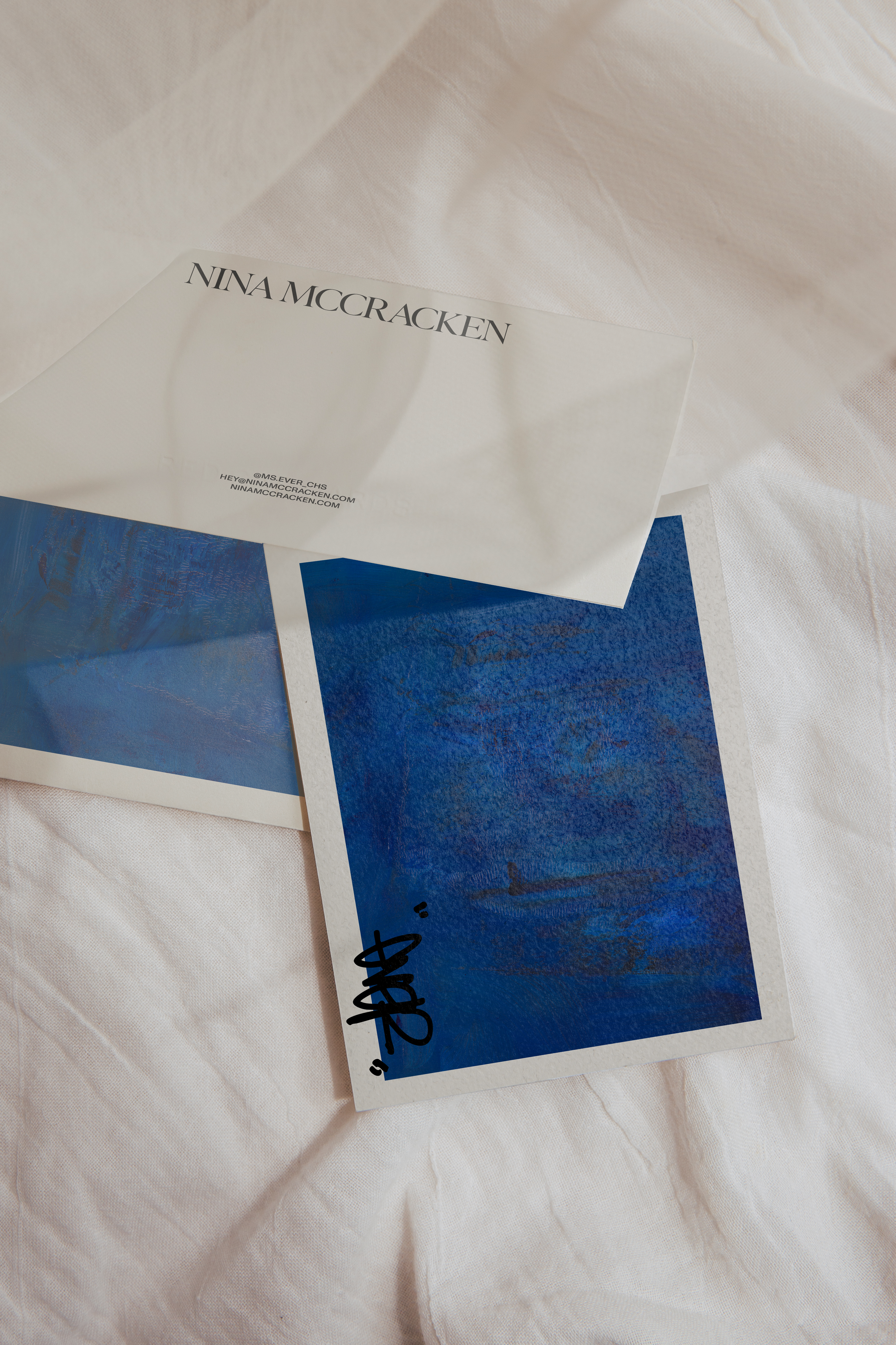
We built the identity around that contrast. An elegant serif wordmark and editorial typography bring in the more refined side of Nina’s taste, while a straightforward grotesk keeps things from feeling too precious. The palette pulls from that same world—deep midnight blue, oxblood, black, bone, denim, plaster, and a muted gold—colors that feel rich without turning the brand into a conventional version of luxury.