
Turning a homegrown coffee ritual into a brand designed for pop-ups and private events alike.
Services
Brand Strategy
Brand Naming
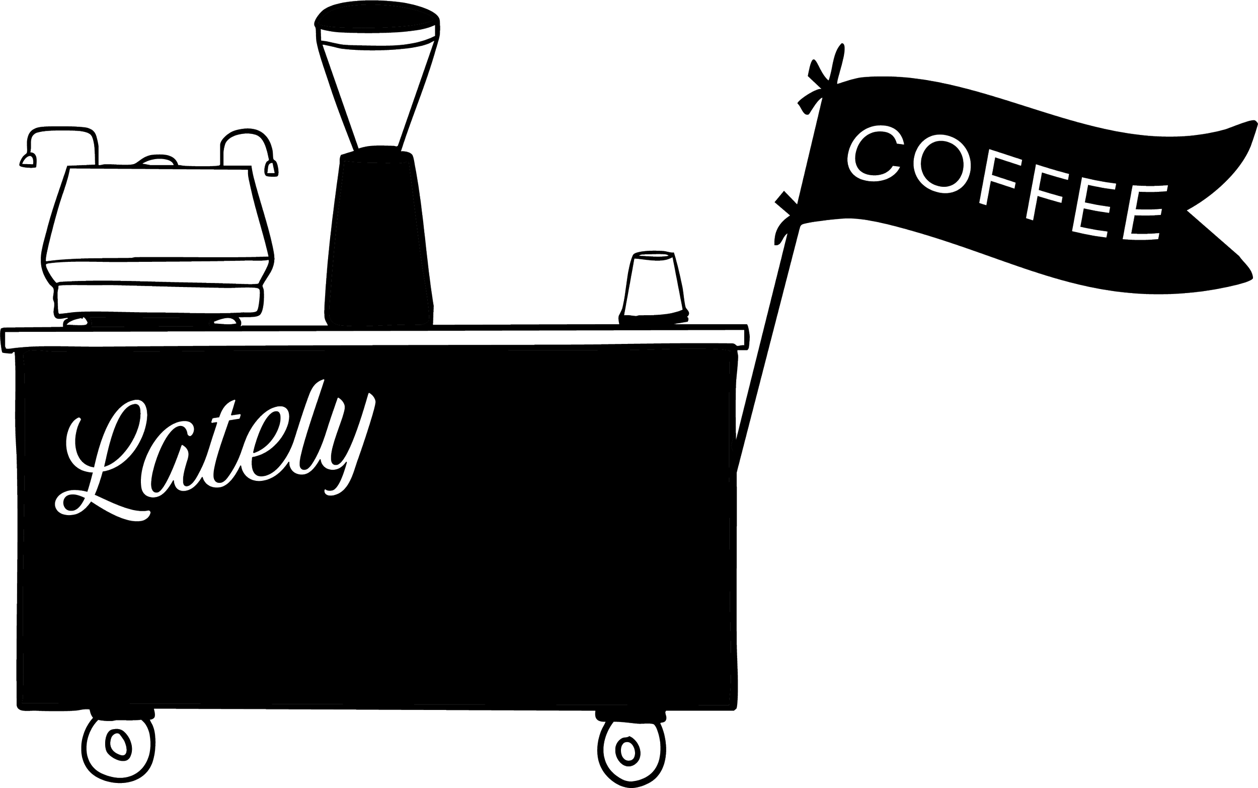
Brand Identity
Marketing Collateral Design
Website Design
Photography Direction
Lately Coffee didn’t start as a business plan—it started at home. After having a baby, the owners bought a nice espresso machine knowing they’d be spending more time in the house. Friends would come over, hang out in the kitchen, and they’d pull shots until they got it right. The husband had spent years bartending, so naturally that turned into housemade syrups and flavor experiments. They jokingly called it “Cafe Mike.” When their gym asked if they’d pop up after a Saturday workout, they showed up with sawhorses, a piece of plywood, and an espresso machine that definitely wasn’t meant for commercial use. That origin mattered a lot when we started branding this. The heart of Lately was never about selling coffee. It was about people hanging around, talking, and enjoying something thoughtful together. The brand needed to carry that same feeling into every pop-up and private event.
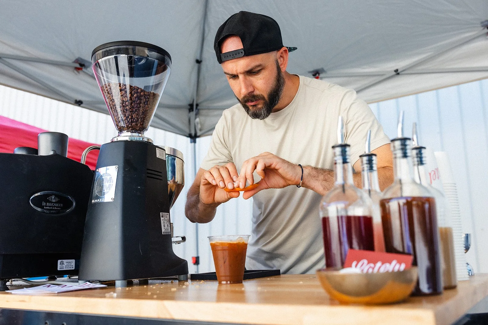
They wanted to serve high-end private events like backyard dinner parties, post-wedding brunches, and corporate gatherings, while still being able to pull up at a gym or in their own driveway and feel completely natural. The strategy was about building a brand that could seamlessly move between environments. We actually built that strategy before we had a name, and we were stuck for a while. We needed a name that spoke to movement and seasonality, and reflected the way the menu changes with fresh, housemade syrups. We landed on Lately—short and punchy, with enough weight in the descriptor to work for more elevated events.
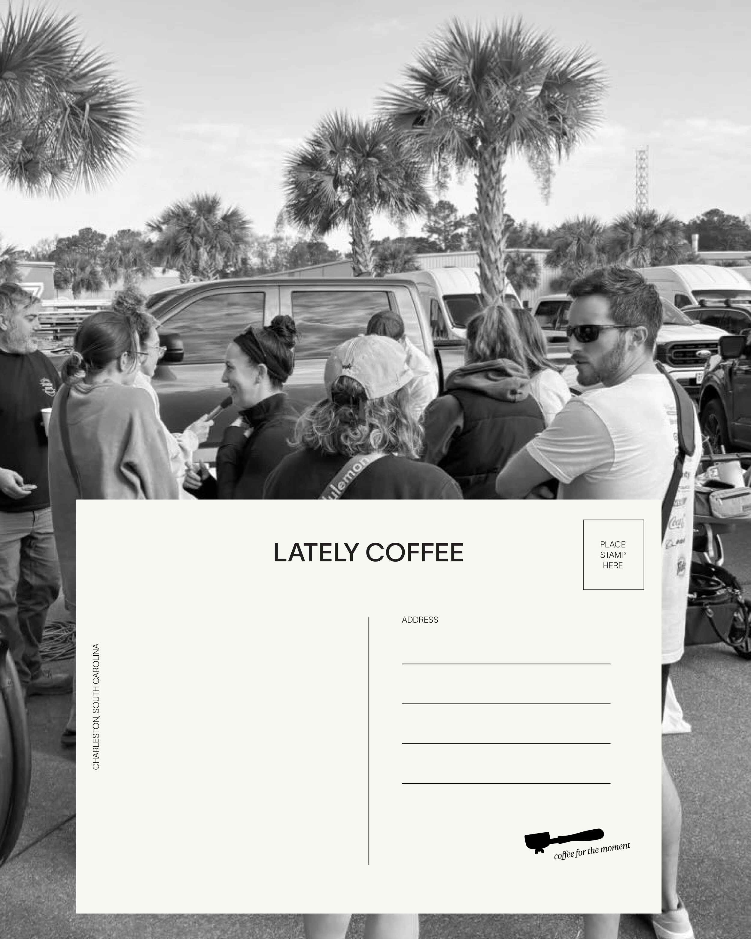
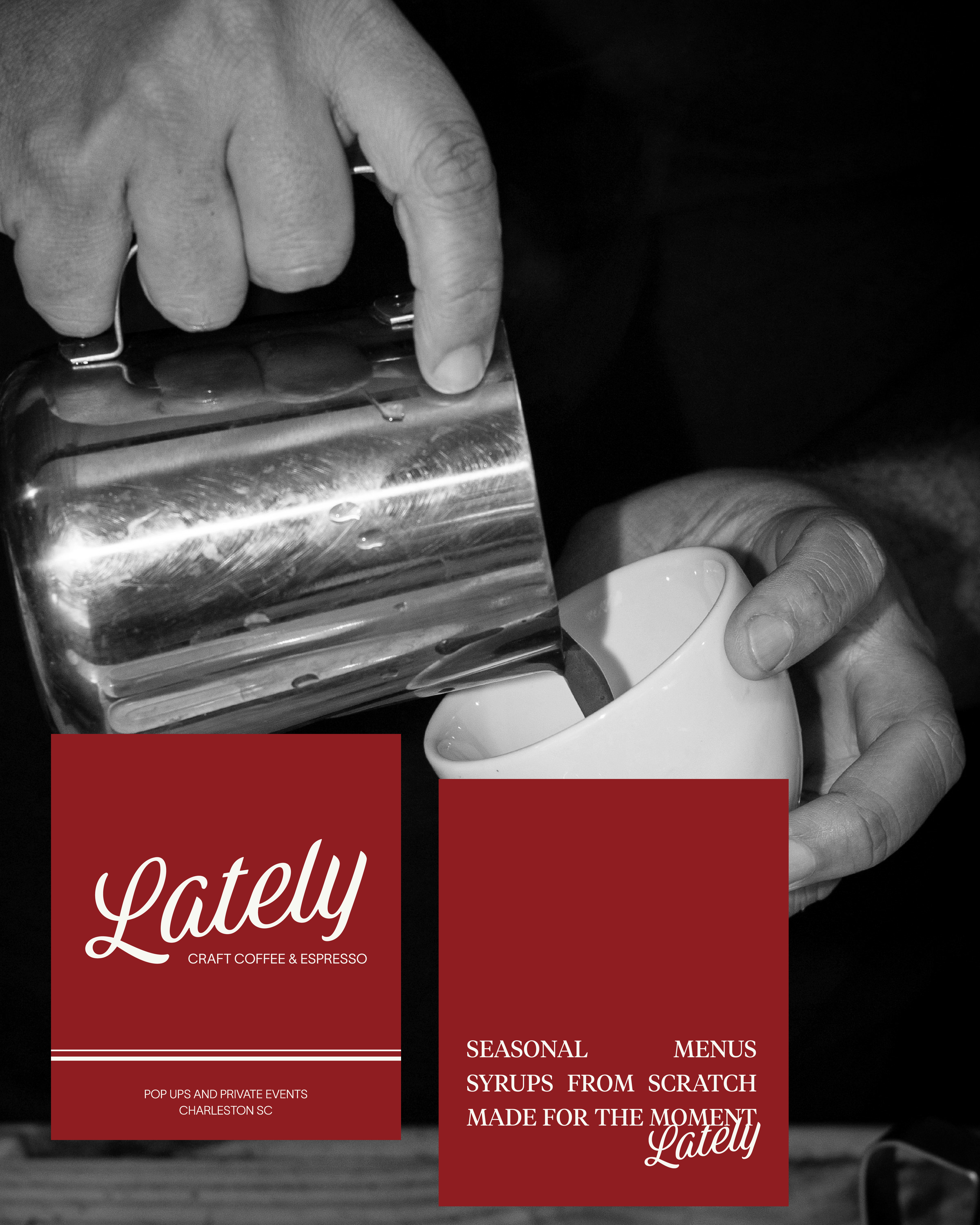
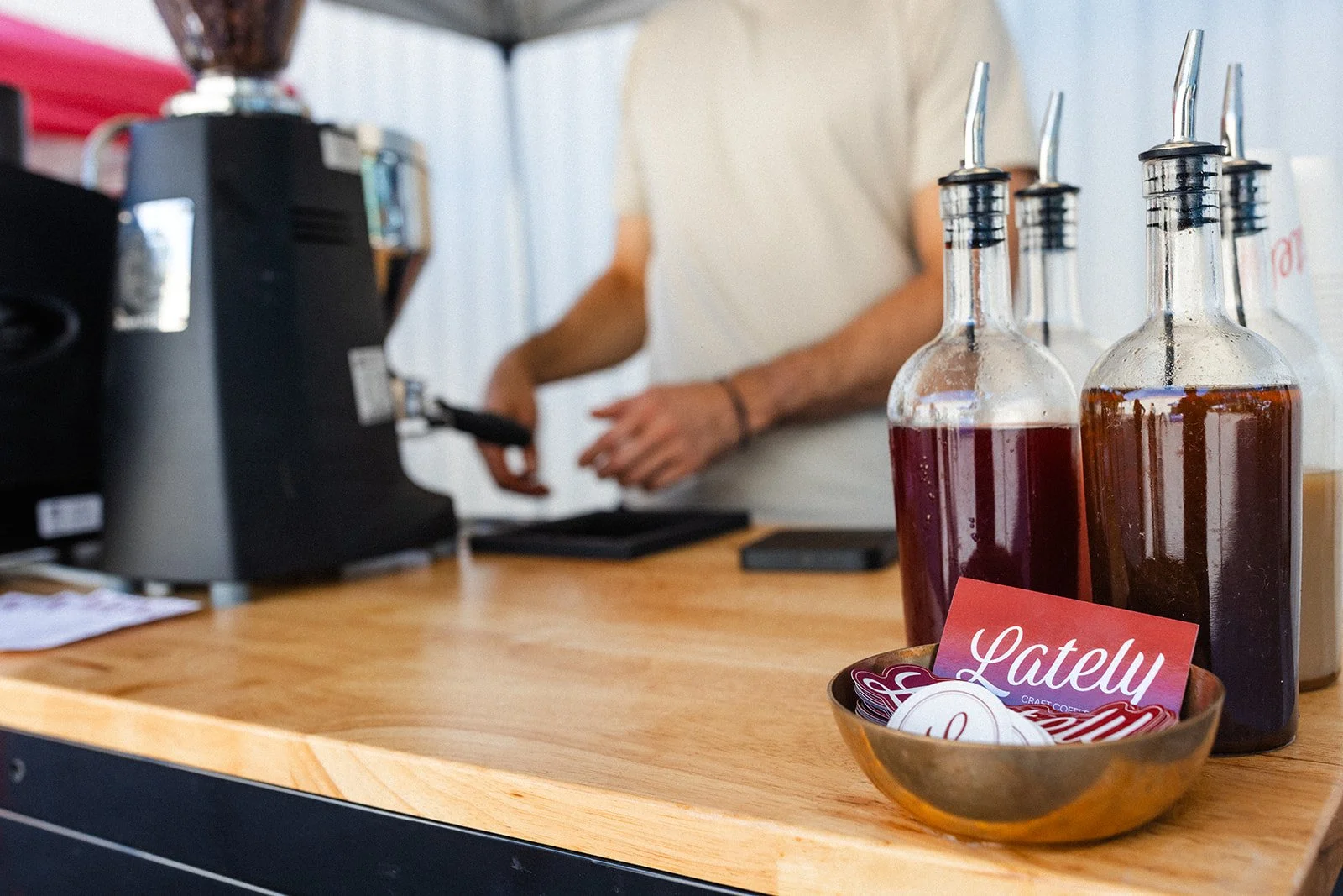
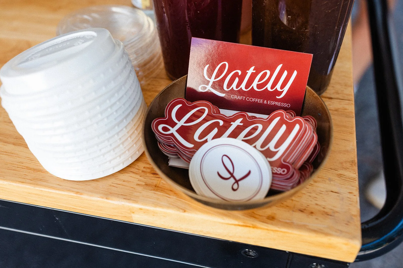
Every visual choice in this brand had a job to do. The cherry red wasn’t a random pop of color. It’s a nod to Italian espresso culture, the husband’s heritage, and those small ceramic cups with red stripes you see at streetside cafés. There’s also a quiet connection to La Marzocco being Italian, which felt right for a brand rooted in espresso craft. The script font pulls from old matchbooks and ashtrays, giving the brand a familiar, vintage feel without tipping into novelty. We paired it with Lausanne to bring balance—clean, modern, and spunky enough to support the pop-up side of the business. That same thinking carried through everything else: postcards mailed after events with handwritten notes, matchbooks in some moments, stickers in others, and the tagline “coffee for the moment.”